Triumph Over Kid Cancer (TOKC) is a non-profit dedicated to raising awareness and funding for pediatric cancer research. With 175,000 children diagnosed each year and only 4% of federal research dollars supporting pediatric cancers, our mission is simple: fuel research that leads to better treatments, brighter futures, and more survivors.
Triumph Over Kid Cancer

Project Overview
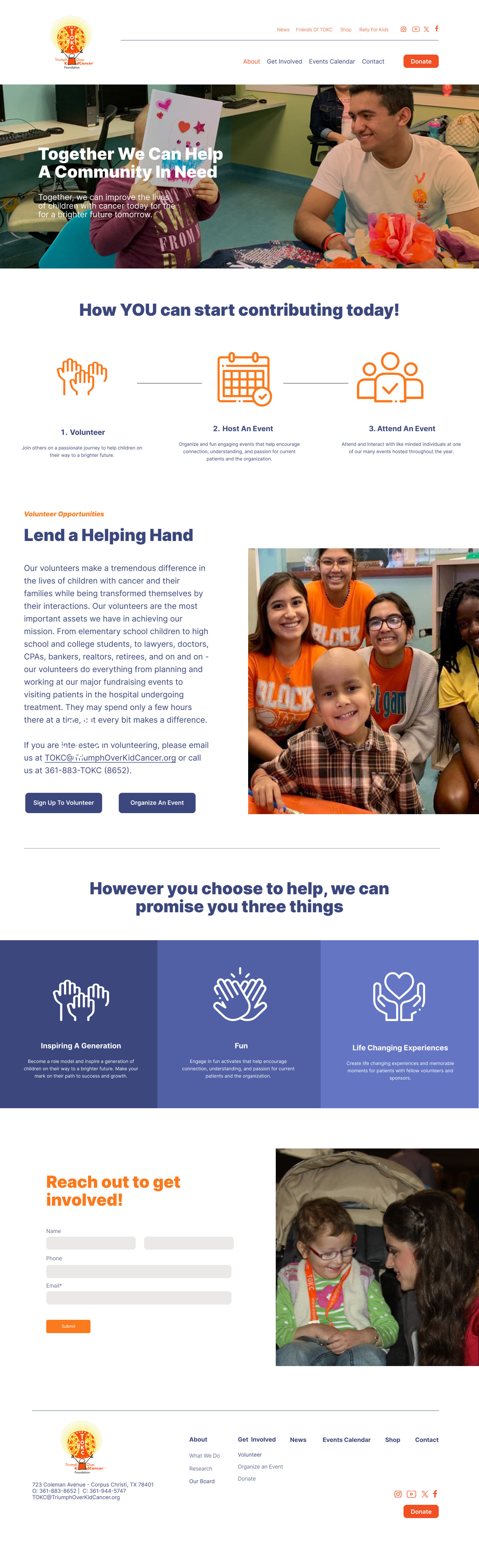
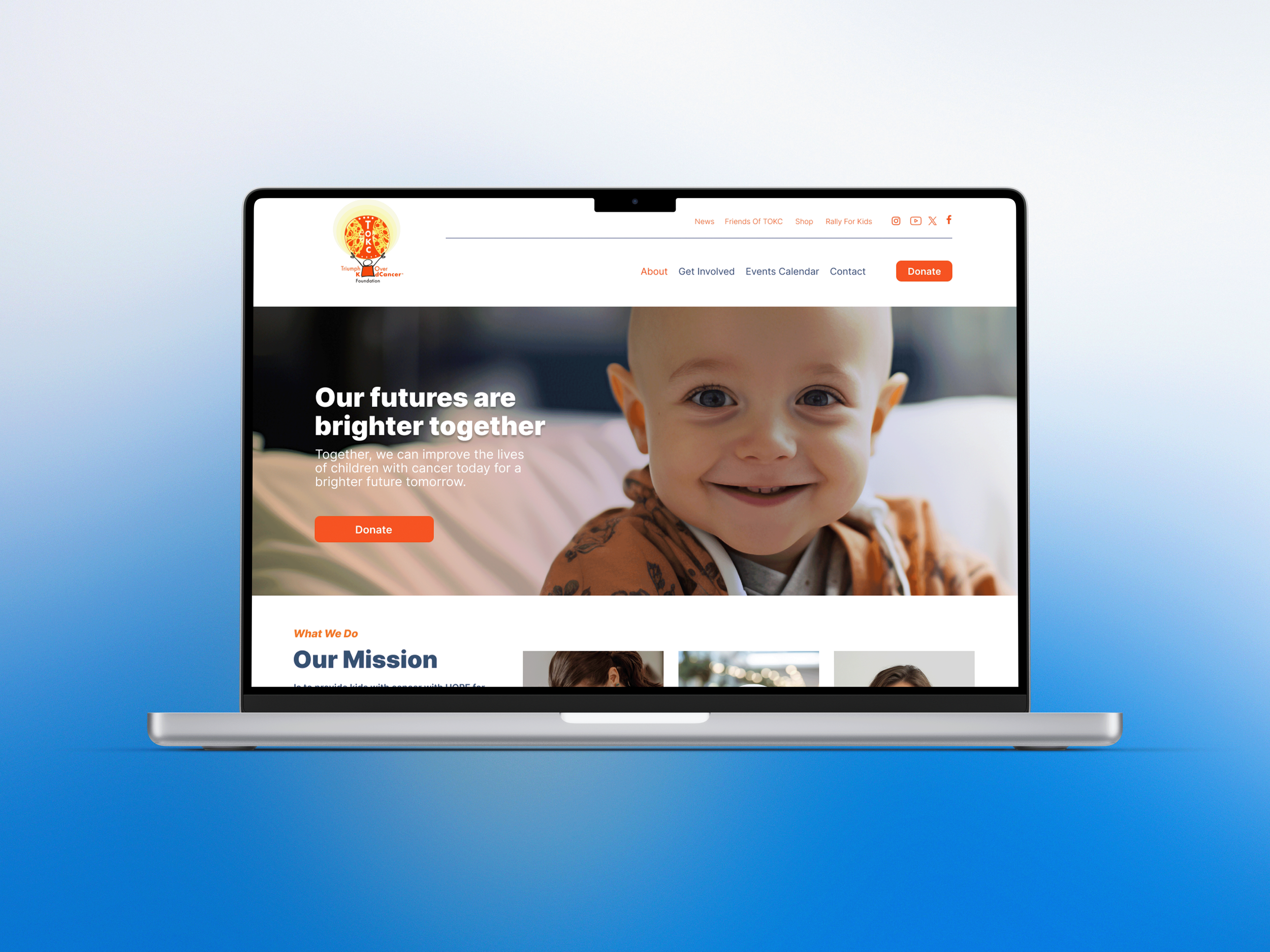
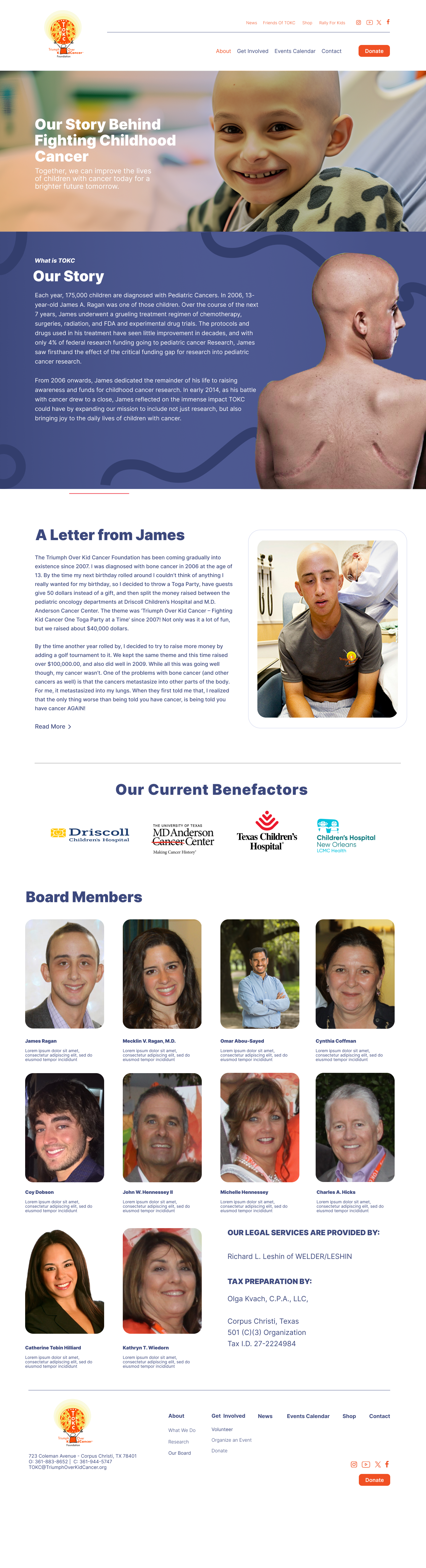
While working at Noisy Trumpet, I led the redesign of the existing website for TOKC—an impactful, purpose-driven project that brought together thoughtful visual design, strategic problem-solving, and emotionally sensitive storytelling. The initiative required a careful balance of creativity and empathy, as the organization’s mission centers on pediatric cancer awareness and research funding—an area that demands clarity, compassion, and trust.
The objective of the redesign was to reimagine TOKC’s digital presence into an experience that felt modern, welcoming, and intentional, while more effectively supporting both their mission and the diverse audiences they serve. This included families seeking information, supporters looking to learn more, and donors wanting to understand the organization’s impact. The existing site lacked clear structure and cohesion, which made it difficult for users to navigate content or fully grasp the importance of TOKC’s work.
Through a user-centered approach, the redesign focused on creating a more intuitive, accessible, and emotionally resonant experience. Every design decision—from layout and typography to content hierarchy and visual tone—was made with the goal of improving usability while reinforcing TOKC’s calm, compassionate, and professional identity.
My Role:
Designer/ Collaberator
Apps Used:


Discovery & Research
The project began with a discovery phase focused on understanding TOKC’s mission, audience, and existing pain points. This included reviewing the current site structure, analyzing user friction points, and identifying gaps in messaging and navigation. Key insights revealed that users often felt overwhelmed or unsure where to start, and important information was buried or inconsistently presented.
Collaborating closely with stakeholders, I worked to identify what mattered most to TOKC: empathy, clarity, trust, and impact. These values became the foundation for every design decision moving forward.
Goals & Objectives
The primary goals of the redesign were to:
Create a simplified, modern digital experience that elevates TOKC’s brand
Improve accessibility and user flow across all key pages
Clarify the organization’s mission and impact through intentional storytelling
Reflect TOKC’s calm, compassionate personality while reinforcing professionalism and credibility
Guide users toward meaningful engagement, including learning, participation, and donations
Strategy, Design & UX/UI
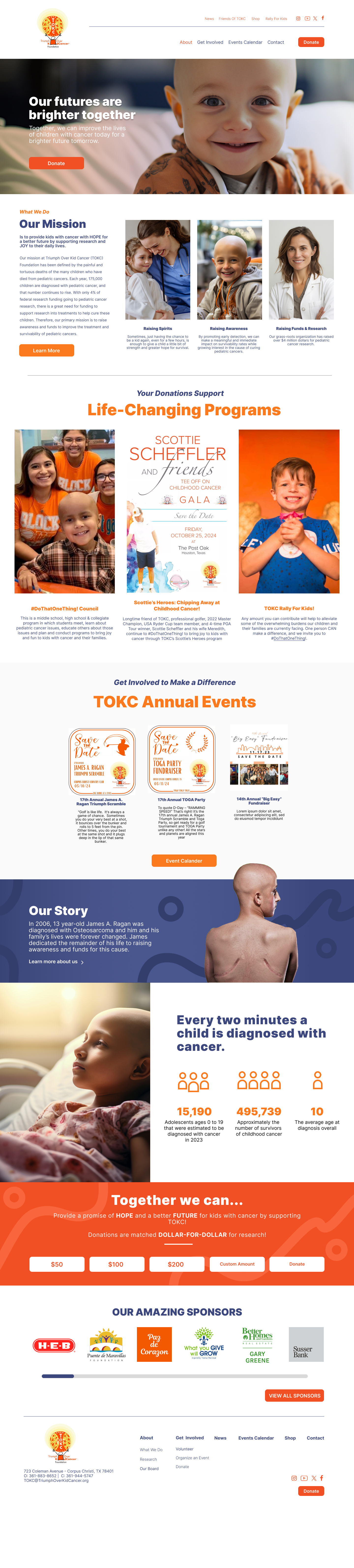
To address usability challenges, I restructured the site’s information architecture to create a more intuitive and purposeful user flow. Content was reorganized to prioritize clarity, reduce cognitive load, and guide visitors naturally through the experience—from understanding TOKC’s mission to exploring programs and taking meaningful action. Streamlined navigation, thoughtful content grouping, and a clear visual hierarchy helped ensure key messages and calls to action were easy to find and understand without overwhelming users.
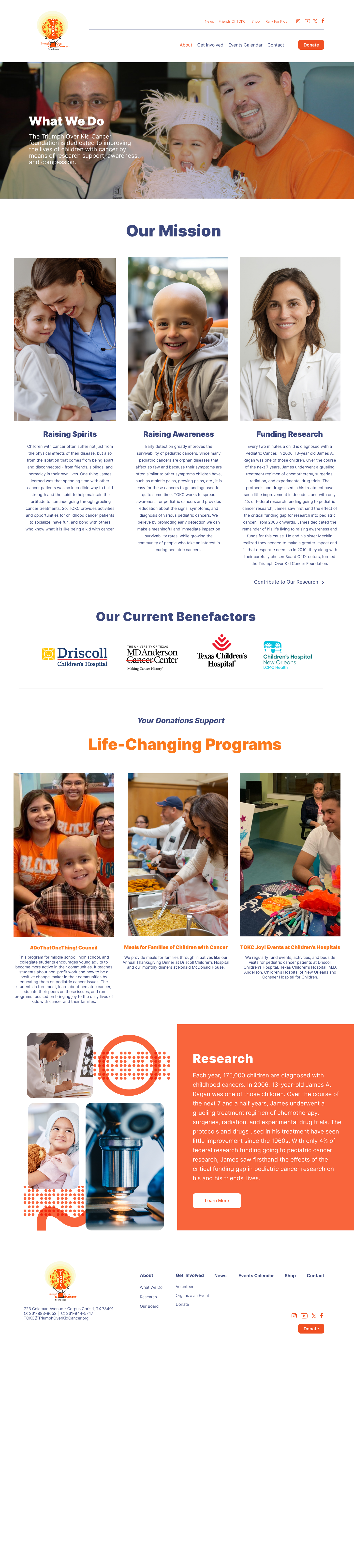
The design approach focused on translating TOKC’s calm, compassionate, and supportive personality into a cohesive visual system. Warm, approachable typography and a carefully considered color palette were used to convey empathy and trust, while balanced spacing and clean layouts created a sense of calm and clarity. The visual system was intentionally understated, allowing the organization’s mission and storytelling to remain the focal point while reinforcing professionalism and credibility.
Accessibility and inclusivity were core considerations throughout the redesign. Improvements to readability, contrast, and navigation patterns ensured the site was usable for a wide range of users and aligned with modern accessibility best practices. By reducing visual clutter and creating predictable interactions, the final experience feels welcoming, intuitive, and emotionally considerate—supporting TOKC’s mission while strengthening engagement across all audiences.
Content & Storytelling
Equally important was strengthening how TOKC communicated its mission and impact. The redesigned site places greater emphasis on pediatric cancer awareness and research funding, using clear messaging and intentional layouts to highlight the organization’s values and real-world impact.
Storytelling was approached with emotional sensitivity, striking a balance between the seriousness of pediatric cancer and the hope, compassion, and purpose it inspires. Content was designed to inform without overwhelming, guiding users toward understanding, empathy, and action.